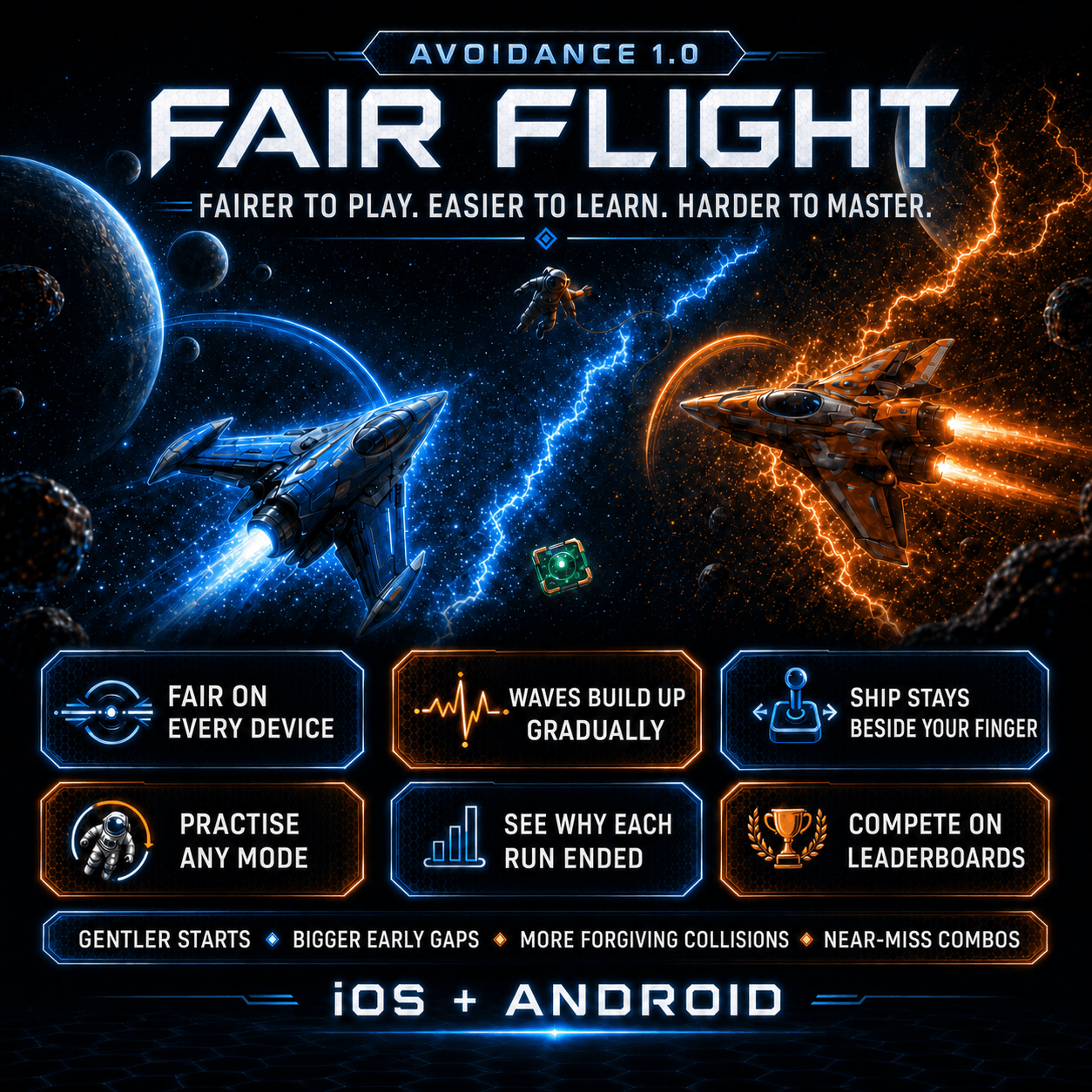
Avoidance 1.0 is the first major update since I brought the game back after 14 years. I have called it Fair Flight because almost every change is about the same thing: making a run feel fair, readable and consistent.
Once the updated build went out for testing, screenshots and feedback started coming back from different devices. That quickly showed where the game wasn't yet fair or clear enough. A layout could look fine on one screen and feel cramped on another. The edge of the playing area was visible on some devices. Text that sat neatly inside a panel elsewhere could be too close to the artwork, or overlap it. One training route could even leave the player in an empty game with no waves coming.
None of those things needed a new game mode. They needed the existing game to behave properly everywhere.
Fair Flight keeps the same basic game: move the ships through gaps in the incoming particle waves, protect the right ship with the right shield and survive for as long as possible. The changes make that experience fairer to play, easier to learn and more consistent on iOS and Android.
The same game on every screen
The biggest change is one most players shouldn't be able to see.
Phones and tablets have different screen shapes. Previously, those differences could affect how much room a player had and how long a wave took to cross the display. That meant a score earned on one device was not necessarily being earned under exactly the same conditions as a score on another.
Fair Flight now uses the same invisible playing area on every supported device. The background still fills the whole screen and the particle waves continue beyond the playable space, so there is no obvious box or border around the game. Behind the scenes, though, every ship has the same movement room and every wave covers the same distance.
In plain English: a larger or wider screen no longer gives somebody an easier run.
Waves now build up instead of simply arriving
The old wave timing depended too much on how quickly a wave happened to move across a particular screen. Fair Flight gives the waves a proper schedule.
Every wave now has a short warning, moves across the field and clears before the game starts the recovery period for the next one. This removes some of the awkward overlaps and makes the rhythm easier to read.
The start of a run is also more forgiving. The first gap appears around the ship's starting position, the first two gaps are wider than normal, and the gaps cannot jump wildly from one side of the screen to the other during the opening phase.
The game still gets faster and harder. It just does so gradually. Easy introduces the idea with one stream. Medium brings in the second ship and second direction. Hard and Ultra give the player a little more time at the start because there is more to keep track of.
The intention isn't to make the whole game easy. It is to make failure feel like the result of a decision or a mistake, rather than an unfair opening.
Close calls should feel close, not cheap
The ships are detailed pieces of artwork, but it never felt right for every glowing edge of that artwork to count as a collision.
The part of each ship that can actually be hit is now smaller than the full image. A wave still destroys the wrong ship if it catches the ship's centre, but brushing a decorative edge is less likely to end a good run.
There is also now a reason to take a risk. Passing close to a wave without being hit counts as a near miss and adds bonus points. String several near misses together quickly enough and the bonus grows, up to a five-part combo.
That gives better players another choice: take the safe middle of the gap, or fly closer to the edge for more points.
The ship stays where you grabbed it
Touch controls sound simple until your own finger covers the thing you are trying to move.
Previously, touching a ship could pull it directly under the finger. Fair Flight keeps the distance between the finger and the ship from the moment it is picked up. If the ship was slightly above or beside your thumb when you touched it, it stays there while you move.
That makes the ship easier to see and removes the small jump at the start of a movement. A coloured halo and a light line show which ship each finger owns when controlling two at once, and crossing your fingers no longer makes the ships swap unexpectedly.
The original direct control remains available in Options for anyone who prefers it. The new offset style is simply the default because it is more comfortable on a touch screen.
The shield display now says what it means
The shield system is deliberately cross-coloured: the blue ship's shield protects it from orange waves, while the orange ship's shield protects it from blue waves.
That made sense once learned, but the original display did not explain it well enough. It was too easy to look at a blue bar and assume it belonged to the blue ship in every sense.
The display now spells it out:
- Blue ship — blocks orange
- Orange ship — blocks blue
The bars also make low shields clearer and say when protection has been lost. It is a small wording change, but it removes a lot of unnecessary guessing in the more difficult modes.
Training teaches one thing at a time
Each mode now has its own short, playable training section.
Easy teaches how to pick up and move the blue ship. Medium teaches controlling both ships and explains the shields. Hard teaches shield top-ups. Ultra teaches the tilt-controlled astronaut and oxygen.
The important change is that the game no longer repeats every previous lesson each time a new mode unlocks. It teaches the new idea, lets the player practise it and then starts the real mode with a properly reset game.
Training can also be replayed from the mode selection screen. Replaying it does not affect scores, unlocks or leaderboards, so there is no downside to going back for a reminder.
Feedback caught a particularly annoying problem here: after completing training, the normal run could start without resetting the wave system, leaving the ships on screen with nothing happening. That flow has been corrected and covered so the real run begins cleanly.
The end of a run now explains what happened
The old result screen was mainly a score and a set of buttons. The new one gives the run some context.
It now shows the mode, final score, whether it was a new best, how long the run lasted, the phase reached, waves cleared, near misses, the best near-miss combo and the exact reason the run ended.
If the score unlocks a new mode, the first option is to try that mode immediately. Otherwise, retrying the current mode remains the obvious next action.
This also went through several rounds of layout changes after testing on different screen sizes. Long score comparisons, world rankings and legacy scores now have their own space instead of being squeezed into whichever gap happened to be available in the artwork.
Fair Flight gets its own scores and leaderboards
Changing the playing area, wave timing and collision rules changes what a score means. It would not be fair to mix a score from the old rules with a score from Fair Flight and pretend they were directly comparable.
Existing best scores have not been deleted. They appear as Legacy Best scores. Fair Flight starts a new set of local scores and new leaderboards for Easy, Medium, Hard and Ultra.
On iOS those leaderboards use Game Center. Android now has the matching Google Play Games support, including sign-in, score submission, world rankings and the native leaderboard screens. Both versions use the same Fair Flight rules and the same four difficulty boards.
The less exciting fixes still matter
A lot of the feedback was about presentation rather than game rules, and it was right.
The visible frame around the game field has gone. The space background carries on naturally beyond the internal playing area. Mode selection, training completion, results, scores and options have all had their text spacing and alignment tightened so labels remain inside their panels. The post-training reset problem has been fixed. Android has been brought into line with the iOS layouts rather than being treated as a rough copy.
There is also now a small version number in the bottom-right corner of the main screen. Most people will never need it, but if somebody sends me a screenshot or reports a problem, it is immediately clear which build they are using.
These are not headline features. They are the sort of details that decide whether a game feels finished.
What Fair Flight changes overall
Avoidance 1.0 does not try to turn the game into something else.
It makes the opening less abrupt without removing the later pressure. It makes collisions more forgiving without removing the risk. It rewards near misses. It makes touch control easier to see. It explains shields, training and results more clearly. It gives iOS and Android the same rules and their own platform leaderboards. Most importantly, it makes a score earned on one device comparable with a score earned on another.
That is the foundation I wanted before adding more to the game.
You can read more about Avoidance: Particle Run or download it from the App Store.